ForumsArt, Music, and WritingWhich color is the best?

21 9564
JaGgEdGe
offline
JaGgEdGe
75 posts
Peasant

http://i47.servimg.com/u/f47/12/57/24/89/flamin10.jpghttp://i47.servimg.com/u/f47/12/57/24/89/arctic10.jpg
http://i47.servimg.com/u/f47/12/57/24/89/templa10.jpg
http://i47.servimg.com/u/f47/12/57/24/89/abstra10.jpg
http://i47.servimg.com/u/f47/12/57/24/89/flamin12.jpg

Please post your opinions about which you would prefer to see as a background or a signature. Explain why if you want as well.

Thanks,
JaGgEdGe

  • 21 Replies
GregWeeler
offline
GregWeeler
259 posts
Nomad

Hmm... The aqua one is the best in my opinion. It kind of makes you feel like you are underwater looking up. That last one is ok, but it doesn't compare to the blue one. The rest of them kind of stress your eye looking at it, especially the 2nd and 3rd one. They white in them makes it way too bright.

In conclusion, pick the aqua one.

god_of_classic_rock
offline
god_of_classic_rock
299 posts
Nomad

I agree with gregweeler

Arax_Nisanu
offline
Arax_Nisanu
1,305 posts
Nomad

Definitely the agua one. It is a lot smoother than the rest. 2 and 3 look to sharp, and have way to much white. The blue one is balanced and does not really have a focal point. If you don't mind me asking, what did you make them in?

KHROME
offline
KHROME
618 posts
Nomad

red is totally the best!!

StarScreamer
offline
StarScreamer
608 posts
Shepherd

I have to say that the 3rd one is the coolest.

Wittman
offline
Wittman
318 posts
Nomad

Red is pretty cool but I think blue is the best.

airdude123
offline
airdude123
266 posts
Nomad

they are all soo cool..i would be happy if any of them were..

DragonMistress
offline
DragonMistress
1,058 posts
Blacksmith

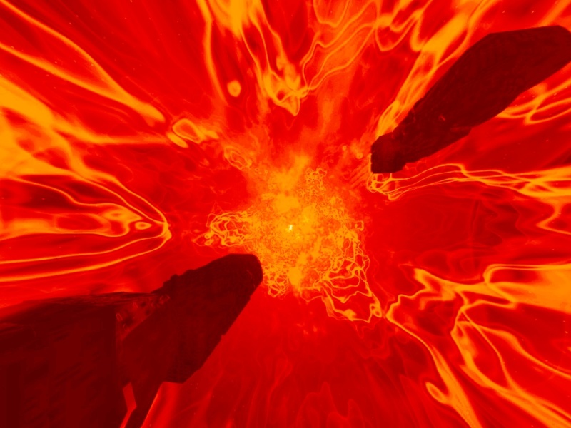
I really like the first one, the red, but I think it might be difficult to have that as a background and still have the writing in front of it be legible. For harmony between background and the font in the foreground, I like the second to last one, the blue.

Jikek
offline
Jikek
1,186 posts
Nomad

the 3rd one. i used to like fire but now i like water and electricity

camaris
offline
camaris
7 posts
Nomad

i lik+e the third one best too

JaGgEdGe
offline
JaGgEdGe
75 posts
Peasant

Hmm, a lot of people are liking the one that was easiest to make, the third. Others liked the blue and red. I did this just experimenting, so yeah. Thanks to everyone who picked a color.

If a mod reads this, feel free to lock or delete this topic, as I don't need more opinions, although I wouldn't mind them.

EL_Dyablo_666
offline
EL_Dyablo_666
579 posts
Nomad

I would say red because it looks so beautiful.

JaGgEdGe
offline
JaGgEdGe
75 posts
Peasant

Sorry Arax Nisanu, I missed your post the first time. I created them using GIMP. I just fooled around, and eventually got a basic picture, which I modified into colors and templates.

MafiaSlayer
offline
MafiaSlayer
159 posts
Nomad

My favorite's are the 3rd and 4th, very nice work!

jeffwak906
offline
jeffwak906
237 posts
Shepherd

The second and fourth colors are great! Good background for a signature, and as a comparison, red can make people angry, while blue on the other hand soothes people and calms them. (Such as myself!)

Showing 1-15 of 21