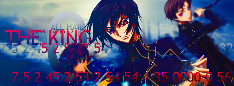
I think you need to take out the gold/yellow you have now and make it the focus of your signature. Like have a crown be the only golden thing in the picture, so an observer's eyes go straight to the crown.
Maybe have more focus on the king (you) in the picture. I got the idea, since that middle character is the only one that is defined, but maybe emphasize this a little bit, like with better clothing, etc.
The eyes. The main focus in a manga drawing (if that's what this is) is the eyes, so make them a bit clearer and brighter.
What's with the numbers? I like them, but I have absolutely no idea what they're for.
Maybe make the lettering a bit less blocky? It would be nice to have "ALL HAIL THE KING" in a smoother font.
Anyway, I think this signature is really good. I hope I didn't sound too negative above, because I sure didn't mean to. Hope all that helps!
The first one is pretty good. I can't see the second one at the moment though >.>
I'm confused about the numbers. What were they supposed to me. Also you could make the yellow a bit duller so it won't stand out as much. Or did you want the yellow to stand out?
Anyway, I didn't make the renders, I simply used them in the signatures. (The yellow is a part of them.) The numbers are to fill space and the large 0 is relevant to the character.
Oooh that one's supercool! However that reddish glow conflicts with the red text...
I like the bit next to the name, the two questions. It helps connect the picture with words. I like that. It looks like there's a bit of text above these questions. Is it something that is important and is it text at all? I wasn't sure.
The only thing I don't like about these is the size. I like small signatures, maybe medium signatures. But these are a bit too big. Maybe you could put the original version and then put a resized version?
awesome! i like what youre doing, there is definatley a conflict in the reds on the second one though, maybe brighten up the whole pic and make the BLACK ROCK SHOOTER a solid black, i dont know, but i like these, keep going!
Neat looking, I must say. However, you do need to cite your sources for the images used in your sigs. It is common courtesy to credit at least the place you found the images, if not the artist behind them. Same goes for additional brushes that are not standard to the programme you use.
![http://i406.photobucket.com/albums/pp142/Raidensakura/flames.png[/[img]http://i406.photobucket.com/albums/pp142/Raidensakura/brs6.png](http://i406.photobucket.com/albums/pp142/Raidensakura/flames.png%5B/%5Bimg%5Dhttp://i406.photobucket.com/albums/pp142/Raidensakura/brs6.png)