Lots of ghoulishly gory, screaming scary, horrific Halloween images this round. I loved every one o' the them and, frankly, deciding the top 2, let alone a winner, was extremely difficult.
Winner: Bronze
The feeling this image poses is extremely strong, and is quite literal and unique. Its monochromatic color scheme makes it simple, while details such as the "Dead End" sign and the man standing in absolute silence were fabulously gripping. I loved how the 3 main focal points of the image (the man, the sign, and the house) balanced and added to each other. The man's head resembles that of a skeleton, while in his left hand is something that appears to be a weapon of some sort. The fact that he stands next to a Dead End sign shows that, frankly, this end of the road will be dead for the soul who lives in that far away house. The silence and solitude of everything was breathtaking because it led to that feeling of absolution before a large, exciting climax. Several have tried to capture that dramatic feel, and, you, Bronze, have done it better than many others could dream of.
Runner-Up: Cenere
The overall idea for the image was awesome, and the art skill you poured into this made it all the better. Much like our winner, you tried capturing a specific moment, but instead of capturing the "Before" feeling, you captured that "After" feeling, as shown by the blood, torn comic book, and amusing Evidence mark in the lower-right corner. It was fairly ironic how the cartoonist worked in his studio, imagining a death very much similar to the one he was about to receive. The artistic side of the image was very, very creative and you didn't limit yourself what so ever. The blood on the image looked scarily real and the faded color on the paper and tears only added to that feeling of violence that occurred during the fight. I did have a few problems with the image; it was difficult to decipher, and if I were to show it to a friend I doubt they would be able to pick out the victim was a cartoonist, and the "meta" dragon was confusing. It required a little bit of background knowledge to completely understand what the image represented, and the ultimate message couldn't have been translated as well as it could have been.
kegaumongo
Ah, yes. The almost cliche moment where the main protagonist falls to his knees in front of a devastating event, as he screams "NOOOOO!!! Out of almost every other entry, yours definitely made me feel that moment of uncertainty for what would become of the field, as well as the anger that I couldn't do anything about it. The flames were actually one of the best pieces. Had they been lower than the trees, it wouldn't have created such an angering feel, but because they were towering over the trees they were far too horrific to put out. The way the red contrasted with the grayish white background pulled my eyes to that fire, which was essentially the heart of the image. The composition of the trees showed an excellent passion for what you had once loved; the shape of them left me sympathetic. Although it was probably intentional, the image is pretty simple, and I wish it wasn't. I felt if there were people standing near by I would have more of a feel of how they ruined your country and how your people were affected.
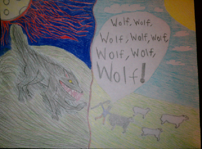
dair5
I was confused by your image. On one side, we have an evil wolf obviously prepped for blood, while on the latter we have a boy literally crying wolf. I think the hillside was drawn to show it merged in the middle, and that something was in store for the boy crying wolf. Or, maybe, the boy was sprinting away crying wolf as the evil followed him and the sheep. The sheep have a rather strong presence; wolfs eat sheep, and the boy is comparable to such of sheep. They both are scared and vulnerable. There are lots of unanswered questions posed by your image. As for the artistic side, it's clear you did well enough work with showing what everything was and how it related with the other elements. Your art skill was fair enough in composition that I could tell the imminent fate of the boy due to the wolf.
lC4l
Wow, it definitely was a horrible way to die, and I enjoyed how the ends of limbs were cut off, as posed by the theme, horrific ends. The fact that the dead man was lying upon a cross was a hint towards something, and the obvious relation would be to Jesus Christ. However, it didn't help your image as much as it could because the two aren't like one another in any other way. I could decipher what everything was, including the remote, which was obviously used to activate the blades to end the ends of the man's limbs. The standing man glared at his victim, which posed a feeling of paranoia as the man is still out there, questing to quench is lust for death. The color scheme was simple, as only a few colors were needed, and it made it creepy as well as cold, because there was little contrast, other than the red blood.
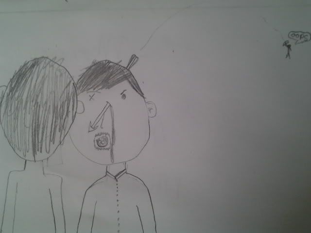
light_chaser
You probably don't realize it, but by using the Rule of Thirds your image your image was a chain reaction of thought. At first, the focal point grabs your eye and pulls it to the victim's eye, where the arrow obviously went through. My eye then went to the back of the head of his fiend, startled by the horrific fate of his conversational partner. Thinking that was it, I noticed a little glob of man in the corner, with a bow and a hilarious caption of simply, "Oops." Immediately I thought of Bowman, a game here on the site, as well as the popular phrase, "BOOM! HEADSHOT!" A thought provoking image, and gave me a feeling of both comedy and tragedy, which is something that even Shakespeare used. All that was needed for the image was a simple sketch; color wouldn't help very much.
thepunisher93
The man waiting for his fate, whether by suicide or execution, was heart stopping. The town gathering around the man showed either a complete disregard for assistance, curiosity at its finest, or a satirical look on ourselves that we just like to see **** blow up. It left a good background story to be told about the violent the time period depicted, and if there were more of a background story to go off of, it'd be a great piece all in all. But that's the thing - it's a man awaiting his fate. I feel there's more that needs to be told. The massively drawn cannon inches away from the man's chest shows that he will not live, and the lit string heading towards the cannon was darn well enough to see, and was virtually a timer until he met the devil. More detail could have been put into the town to help it make look more satisfyingly full.
--------------------
Bronze listed himself as an emergency judge because he's judged ASC before, and he obviously knows a thing or two about art.
Fantastic participation this time around; glad to see so many people willing to show some art.
The next theme will be Authority and will be due Friday, November 9th. Good luck!