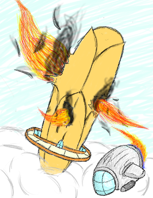
Despite there only being 4 submissions, I wanted to pose a theme that would make the artist think. I didn't expect too many submissions at all. For what there was, each piece was interesting in its own way, as they all held a different feel of their own but had the authority theme somewhere in the pic. (No runner-up due to lack of submissions, just so ya know)
-
Winner: thepunisher93
Yeah, I know that was unexpected. After a lot of contemplating and deciding on whether reflection of theme or general artistic skill should be weighed more heavily, I decided that keeping the original theme would be more important, and no one did it better than thepunisher. It's a judge, and in his sitting, he resembles the stature of a king because he his sitting at an uneven perspective to make him look higher up. It's his choice what shall be and won't be. It's his decision of whether you are free to go or if you are to die. The ultimate authority comes from those who are above you, and the slant of the entire image plays a mind trick to make the viewer feel like the judge is higher up. On his table thepunisher placed everything the judge would ever need, and shaded them to make them stand out, because, after all, what is a judge without his tools? The portrait behind him provides a feeling of legacy. There were judges before him, and there will be judges after him. As for the more artistic side, a monochromatic black-and-white color scheme is all that was needed to show the judge, and, frankly, color probably wouldn't have helped all too much because it would take away the dramatic feel of the judges yes-or-no power. In other words, the judge's decision is black and white. His prominent stare over his disciples displays the ultimate stare of authority, which the way the eyes are squinted.
-
Cenere
A hilarious depiction of what I imagine is Cen's mind. Inside his mind he has all of his shenanigous little creatures, and none of them pay any attention to what he says... or in this case, thinks. The creatures are drawn to show body parts not shown in a portrait, such as the behind of the thing on the chair, to resemble the chaos inside his mind. Each creature stands out on its own and could definitely be the focal point of any image because they are all interesting because they are unique. The black and white shapeshifters balance the image out, because the darker one is on the left side and the white one is on the right. This method plays off the rule of thirds and helps pinpoint the focal point towards Cenere, who is, after all, the main subject. The chaos and rebelliousness are confirmed by Cenere's statement to the deer on top of his head as well as his finger shaking rapidly; he is definitely mad. I felt color could have helped the image pop out a bit more, and some background around the characters would give it a much deeper feeling. In other words, small details help the characters have their own little backstory.
-
kacboy
I love that game, so I had a bit more difficulty judging it because I needed to feel it from the perspective of the kid who hasn't played it. It could easily reflect that of any officer. The badge stands out on the officer's jacket because of the excellent contrast in colors. The individual pixels deserve an achievement all in their own, because your use in stippling made that image come alive! Each little detail is made of its own pixel. The pixelized officer in the wild west is kind of a contradiction, because, well, the wild west occurred a hundred years ago, and we haven't had pixels for very long. It was interesting seeing the two come together. Despite the charming use of pixels, I wish there was more to it. Sure, the officer is an authority figure, and he isn't really showing much authority. He's just pointing his gun. If he were, say, arresting someone, the image would have a more wholesome feel. I wish it had more...
-
Bronze
Certainly not coming in last, we have Bronze's draugr sitting upon its throne, in its deep, dark cave. He is sitting, looking depressed, with the shading of his body making his head appear like its tilted downwards. I live the detail you put into it. The lighting fixtures stood out well enough for me to see them, and the flames blended in with the back wall brilliantly. I love the soft pencil you used along the outside, and then the harder pencil you used for the inside. From the focal point of the draugr and out, the squiggles continue to get looser and looser, as they get darker and darker. That was a fantastic way to keep my eye on the lighted room where the draugr was. The only real problem I had was the squiggles; there were just too darn many. If you were to shade in a way so the seeds matched up with cave walls, it would've looked absolutely phenomenal. The squiggles also take away from the immersive detail you put into daugr. Other than that, excellent work around the bright focal point.
--------------------------------------------------------
The next theme will be Futuristic Technologies and will be due Sunday, November 18. Any questions? Feel free to visit my profile, as always.