Last theme: Fanart
I am rather impressed with this round. Not just the amount of participants, but also the uploaded works. Sadly, there can only be one.
Winner:
ABarOfSoap and the literal fan art.

This was a good idea and a fine concept. It might have been executed a slight bit better, but even so, it tells a story and takes you somewhere. A good illustration of, why not asking for the meaning of the theme will pay off in more freedom and better ideas.
It is well drawn, even with your "Blergh" comment, though I can see why the sketchy quality in the surroundings might make you say that. But for the purpose of the art, the detail to the more important aspects of the drawing pays off well anyway. I could have wanted a bit more depth to it, story-wise, perhaps with a cityscape in the background and ruins around the - fans, to illuminate that someone might have lived here, but left for something else, abandoning their trusty helpers after so long. But that is marginals. Technique-wise, there is only the sketchy quality to put a finger on, and that you might have gotten a bit more out of the background by smudging the lines a little to give a more uniform texture.
As for the rest of the fine collection of more typical fanart:
Dair5
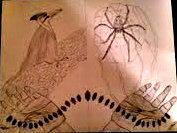
I won't comment much on this, since I can't see it very well, but it looks like it might have had potential to be a nice piece of art. The details on the hands might be a little too much shadow-wise, and even if you are not well versed in the style, keeping a lighter manga style to at least this part might have been better.
I hope you figure the scaling out for next round.
Gaboloth
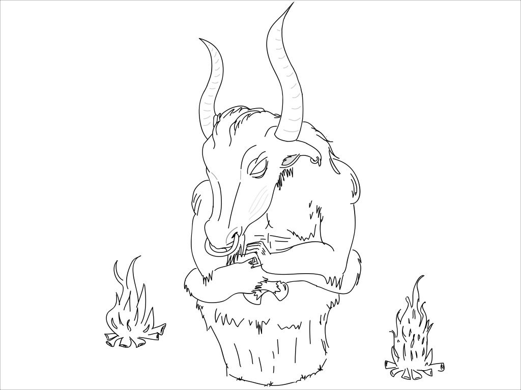
I have this odd urge that you might have rushed to make this, since some of the lineart is rather heavy and stiff and the anatomy is a bit funky, but it doesn't take away from the concept. I know a little about BoI, and while I haven't seen this particular character, you do manage to put a more ominous feel into the drawing with the detail and more realistic style. Perhaps a background would have been in order, to make the atmosphere more tense and give the illusion that you are caught with that guy? Colours and some lineart would have done it well.
Strop
This is a huge file, so I won't post it here.
Fine, clean lineart, though the background could have done with a bit of cleaning up, especially now that there are no colour, but with the main focus being relatively clean, and the lines thicker, it should draw most attention on the our protagonists. The style is consistent, though there is a clear touch of 'Strop' over what I assume you wanted to be mainly SC, but it can be hard to translate well.
While the drawing is tight and tense, I can't help but think it is also a bit static, and that there might have been more punch in another concept or a different position, but that might just be consideration for another time.
Killersup10
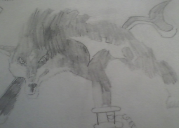
The anatomy is a bit wonky here and the drawing itself is not particularly dynamic, but the character is recognisable and the photo is of a better quality. You might consider drawing with a thicker line next time, so the photo quality doesn't ruin the image too much, and then start playing with cell shading for a better defined figure.
Personally I believe you should consider freeing yourself from your restrains and start doing some freehand sketched, even if you are going to eyeball an image, because the stance and anatomy might improve and become more fluid and dynamic, not to mention a bit more interesting to look at, and easier for you to define.
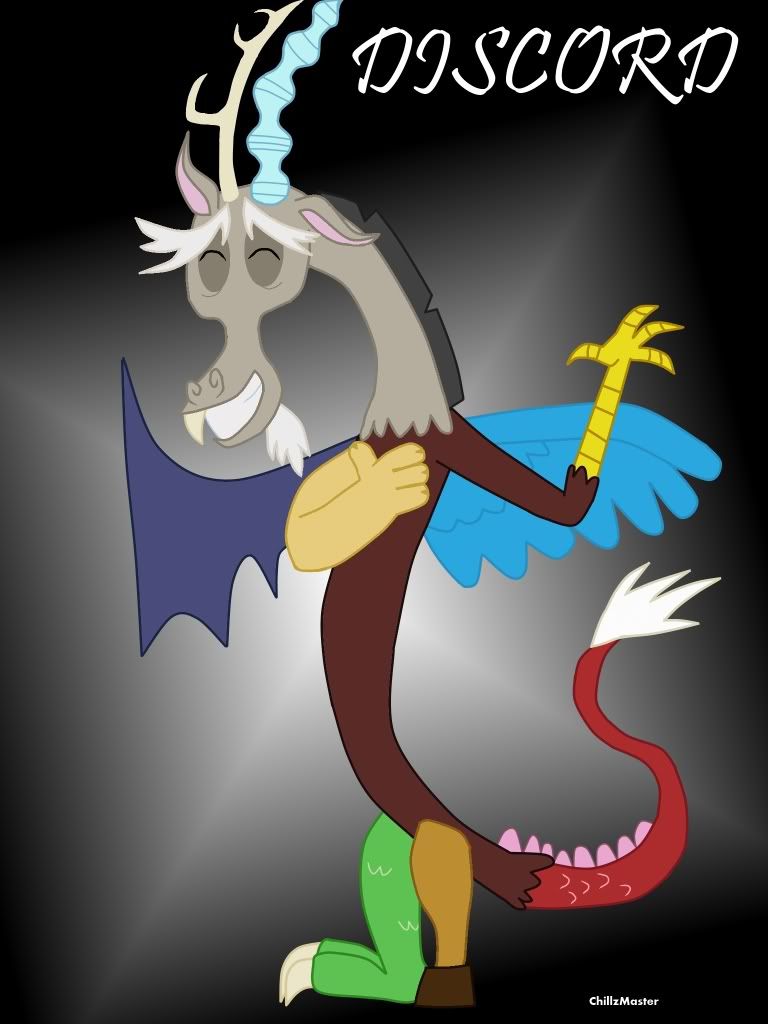
ChillzMaster
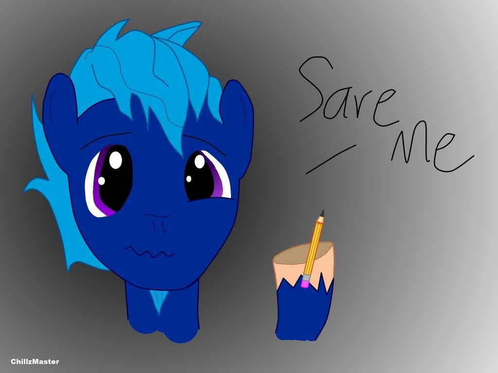
I refuse to acknowledge your request for a disregard for a quite obvious reason: Otherwise you would have had nothing that could be judged.
The idea here is funny, not to mention I have no idea how ponies actually write or draw anyway. The style is consistent, not only with your own, but also with the official pony animation. Nice expression and good use of gradient in the eyes.
The appeal of the pony-animation tends to be the smooth, thick lines and the rounded characters. I do think you could achieve more by keeping this in mind. If you make the line thicker, it is also a bit easier to make it smooth, and you would be able to define the character a bit better. It might also help getting some direction on the hair.
I will applaud you for opting on a gradient background. Putting a bit of texture behind there does make the image easier on the eye than pure white does.
Koshonos

GLaDOS is unimpressed. I like it. And I don't think I have any further comment to make on that.
It's a neat picture, the overly big pixels does well for the art, and the half-border seems fitting somehow. You might want to consider colouring the outline a little, so the black doesn't contrast so heavily against the white, even with the lightly coloured background. Just a slightly lighter grey to ease the contrast, it would be good.
Well done.
And, I think that was it. It was nice to see what you could all think up, and you all did a good job on this theme.
So, to ruin all this fun and games, I am going to give you a harder theme. I have faith in you to do something awesome with it.
Good luck.
Theme: Gaslamp Fantasy
Deadline: Saturday 25th
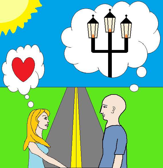
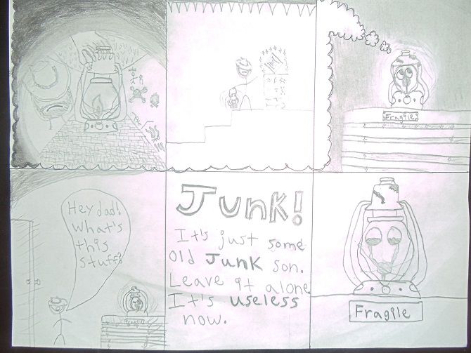 This was the first thing that popped into my head when I read gaslamp fantasy. It's not exactly one drawing, there aren't any rules against that right?