Last theme: War.
Three entries are not a lot, but still it has been difficult to decide on a clear winner, especially now that I can't just leave it ambiguous as I could when there were only two. Says a lot about the nominees for this, doesn't it?
Winner
KingRyan
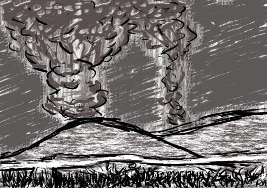
It's a simple piece, but strong in its message. We have all seen that image somewhere, be it film or images, news reports of war struck places, or if we have been there ourselves on either side of the battle. We all might know how this is not just two campfires, that smoke does not look like that if it is coming from a harmless fire, but are massive giants telling of the destruction that is taking place beneath it.
Simple and effective. And this is why it wins.
The picture itself is dominated by those filters, which are rather annoying, but at least brings a different quality to the game. It might have looked better with plain colours, but at the very least, this would not have made the smoke as menacing as it currently is. It looks like a quick sketch, coloured in a hurry, which it might be, but the smoke would have been a lot different if it hadn't been. The quick strokes also speaks positively towards the overall image, while the sky colouring subtracts. The same does the texture of the hills, as it is simply to uniform, not to mention clashing with any logic behind the material the hills are made of. Had these things been streamlined and prepared properly, this might have won more convincingly.
As a follow up:
TBear1996
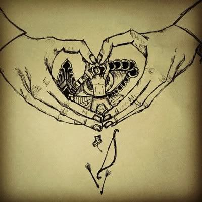
Another strong piece, telling its message to the world, but perhaps in a slightly more complicated way. The title says it all: "Can love stop[...]?" It is probably one of the stronger messages of this type. Whether love for one another, for the earth, animals, living, would be able to stop the destruction of these things, if we tried hard enough, loved hard enough, instead of scolding each other for committing those crimes to life.
More so, however, this type of message tends to forget why many go into war. Why many might end up buying meat from places that does not take care of their animals well, why people are cutting down the forest and polluting the air. It too is caused by a kind of love. Not exclusively a love for money, greed, but also for the love of one's nation, or for the care of others in the nation they are fighting in, because they want something better for them, and for themselves. And people might love their family, love humanity more than they can care for nature or animals. Many do put humanity first.
Anyway, back to the image itself. While it does have a strong message, and certainly a strong imagery, this seems lost for two reasons. The imagery is rather complicated, to a point where many might not see the theme before reading the title question, and the image is rather small, which is sad for both the details and the quality of the art. It is hard to make out anything but the hands and the figure, everything behind him, especially the... bear? is obscured. Not to mention I am a little slow, and keep forgetting the hands are making a heart and is not just the - loving hands of a deity trying to poke in the guy's head. Had the symbols and image been more clear, this might very well have won over KR's.
One other note. Hands are stupid hard to draw for many people, myself included, but I would recommend you took a good look at your own for a while. There are some joints and lack of joints you should notice. Especially the thumbs seem dislocated, and with the lines of the knuckles/hand bones come to an erupt bend, it looks like the hand might have been broken there. Which does well for the symbolism, but it's painful to look at.
Last, but not least
Kyouzou

I won't laugh. It's a good concept, the clear, clean and very war-like, no question. Especially the centerpiece of the drawing, the figures in the dust, waiting for the the planes to pass, watching what they are doing, or perhaps running towards the wall to get out. The components are also well chosen, and it might not have been the same had it been tanks invading their country, as planes and their way of destruction seems much less escapable.
The main issue here might be how you put together the components, and the size difference in many of them. There's a house to the left, but the door is too small for someone to go through. The wall is made of bricks, which seems to be made by smaller bricks where the wall is broken. The flag is also rather large considering how high in the air it's got to be, while the planes seem to line with it and make them look a lot smaller. The dropping of the bombs also seems a bit static (except on the second smallest of them, that one you nailed), perhaps mainly because of the angle of the drop, the perceived behaviour of the bombs falling and the perspective of the planes.
So, as mentioned, this does not deserve to be laughed at. It's a good, strong concept, the execution was just a bit weak.
Very well. For the next theme we will have something that too can contain strong imagery and complex concepts. Deep meanings hidden well.
So, let's see what you can do with
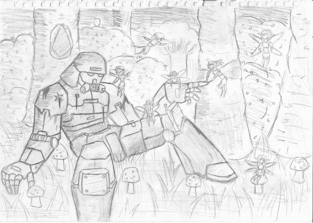
Theme: Fairy Tale
Deadline: Saturday 8th