Last theme: Collage
(Theme before last: Fairy Tales)
So, this will not be a judging. Or, it will, but there won't be a winner. The reason? There isn't enough material to make a proper judging.
You see... I think Kegaumongo[/url] did the best, and only, entry that was actually a collage of the word's usual meaning.

And it's a nice creation, but not in total tune with the rules of this contest with it not being drawn, and the main focus is made out of un-original material. Yet, this is what collages are. Glued together pictures. And it's a nice collage, it looks good, it's creative (I do think I have seen it before, though??) and it is complex, yet simple and easy to make out. Like the popart with a big image being made out of smaller images that fit the colour, background and all.
But. While this stands out, while it is nice looking and fitting the theme, I can't honestly say I would pitch it against the drawn entries as a contestant, without the judging being biased and wrong. You can't compare spoons and helicopters just because they are both metallic, and while a better judge might overlook the major difference in creation, I can't. And I won't. Sorry.
But it is a good-looking piece of art, the armatars are well chosen for their role and fits into the big picture. It's just not original. In any aspect. And more sadly, you have taken one of the things that might be at fault, a simple logo, and "coloured" it exactly like it is in the image. Which, in this enlarged version, means the shadows of the swords are now easily seen, and wondered upon. Why is the shade were it is, and in this case, why is it so much darker than the light side. While it has most likely been a lot of work, seeing that you might have thought about the basics of light and shadow would have been nice.
But eh, bonus points for using one of my custom armatar.
And on the other side, we now have two contestants, and that is simply not enough to make a proper judgement with a winner, at least not in my little world, which you all stepped into when you entered. Three is fine, two is too few.
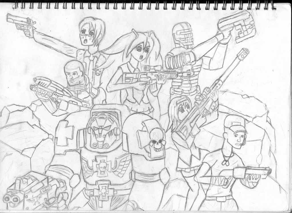
ChromeDeathRazor

Which is a nice character dump, all fit together with guns. Eastern and Western characters together, making a team of... uh, characters. And while the Eastern characters' faces unnerve me in the way they have been drawn, I do believe the worst offence in this drawing might be the lack of shading. It would have lived up the art a lot, and would have explained some of the poses better than however many lines would have done. Not that a certain lack of perspective isn't a problem, but it would perhaps have saved it a little. I will point out some examples of the perspective blunders, if you want to, Chrome.
Either way, more Warhammer guys in full armor, which you do really well, and which stands out compared to the rest of the team. You seem to give those guys more attention than the others, which is good for the Warhammer soldier but not very good for everyone else. But, with a bit of shading and colours, it could have gone to your service somehow.
Keep it up.
Bronze

Which is arguably the bridge between the glued together version of the collage, and the character dump.
And I honestly don't have a lot to say about it. It's that simple-yet-OMG-chaos type of picture, where every inch has something new to look at, but when looked at from afar looks like a mess of lines. Which it is, but that's besides the point.
In a critique, I would point out stuff like the wings being flunky or the ghostly face being way too undefined, but it was most likely the point in the first place.
No words.
The pacman things with teeth are adorkable, though.
And with that... I guess the fail judging has come to an end.
[b]Theme: Supernatural
Deadline: Saturday 29th