This was originall started by fluffybunny442 a while back. Lolz, I necro'd it :P
In this contest, I will give an image to you, and you alter/change the image as much as you can, and make it look super awesome. Then I will judge your image on a scale of 1-10. Also, it would be awesome if we could have 2 or 3 judges.
And, I really would like to participate in this, so if someone else could I would really appreciate it.
I do want to point something out about aknerd's piece.
He used the colours red and orange which are warm colours and look like fall or something. Red and orange may also be analogous colours. Then there is a section of blue. Blue and red are complimentary colours. The cyan is also a cool colour. Also when two complementary colours are mixed they form a neutral grey colour. So the grey streak in the middle of the piece may represent that. There's are harmony between the orange and red and then a discord between the cyan and red. The cyan being cool and the red being warm and also the red and cyan being complements of each other. So there is more to the piece than meets the eye.
I don't know if you can use a simple photoshop filter to make an image look like that. In that case not much time was put in to it. But I feel like there is a harmony in the piece and that it was more thought out than it may initial look. It is a semi-abstract piece.
Reton8, red and blue as well as red and cyan are not complementary colors. Red and green are complementary colors, might want to check your color wheel. Not saying the art was bad, just that your point was invalid. I can happily make up complementary color pairs and find all sorts of 'harmony' in random pictures. You're also not taking into account extension of color as well as the effectiveness of contrast. If you wan't to comment on the color theory aspect of a piece of work, I would recommend you actually read up on color theory first.
Don't worry, there are none. There will be in the second version, but those should be rather obvious to you guys, because I wouldn't try to be subtle.
As for the image, well, perhaps an hour of playing about, saving as a jpg, opening it again and playing with it again. With my sister sitting next to me, commenting on how it looked like a beach and stuff.
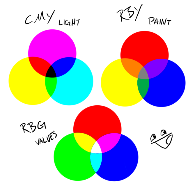
In the RGB color model (and derived models such as HSV), primary colors and secondary colors are paired in this way:
* red and cyan * green and magenta * blue and yellow
Not to mention I took one or two art classed that have covered this stuff. It's just hard for me to believe someone would randomly pick the colours to fit together that well. It definitely had an autumn feel to it. It could have been one filter that produced it. I don't know. I also don't mind the rating that it was given (no offense to the piece).
Look at second prize winner. - The image was resized. - colourized red - posterize filter.
I can't believe that took more work and effort than aknerd. I'm not saying it shouldn't be second. And I'm not saying that it doesn't have more harmony than aknerd's piece. I just feel like there was "hidden effort" in aknerd's piece.
I don't mean to cause a ruckus with the judges or anything. It takes a lot of time to judge the pieces and stuff and it's all voluntary. I just wanted to point out what may have been missed in the piece.
Ah you're right in pointing out the different kinds of color wheels, I was focused on the paint color wheel as paint is generally used in paintings, or room color schemes. I would find it hard to believe that any of the older paintings would use anything but RBY. It is possible that the artist determined a color scheme using an RBG color wheel, but there have been no mention of this and I find it rather pointless to try to look for these kinds of things when 1) you dont even know what color wheel might have been considered, and 2) there has been no mention of color theory for the piece from the artist.
I feel that I am just ranting about this unnecessarily but I didn't intend to go into detail about this. I am no expert on color schemes I admit, and you're right in what you pointed out, but I still think that it was rather useless to try to find purpose in the specific arrangement of colors in the picture without it being obvious as I can find complementary colors in many random pictures, but meh say what you will.
It is possible that the artist determined a color scheme using an RBG color wheel, but there have been no mention of this and I find it rather pointless to try to look for these kinds of things when 1) you dont even know what color wheel might have been considered, and 2) there has been no mention of color theory for the piece from the artist.
Yeah they should have mentioned if they were purposely using those colors or if they were picked at random.
Art theory (or humanities, if they are the same thing) gets tricky. Does an artist sit there and think, "I'm going to do a trompe-l'oil painting that uses foreshortening, chiaroscuro, and aerial perspective." or do they just think, "I'm going to paint a realistic outdoor scene."
Certain aspects of art theory feel unnecessary and over thought. Like it's taking something simple and making it seem like way more than it is.
Manny why do you have to go download the full sized picture everytime? It's getting on my nerves.
Can you use other source images?(photomontage style stuff)
What does that mean? Like rendering in another image? If so, then no. Your effects have to be 100% original (for effects that is). No adding in another images if you didn't draw them.