This was originall started by fluffybunny442 a while back. Lolz, I necro'd it :P
In this contest, I will give an image to you, and you alter/change the image as much as you can, and make it look super awesome. Then I will judge your image on a scale of 1-10. Also, it would be awesome if we could have 2 or 3 judges.
And, I really would like to participate in this, so if someone else could I would really appreciate it.
Oh wow. It's okay jdogg, judge at your own pace. As long as the ratings are posted and I'm not at the bottom of the list, I'm good, and even if I am, I'm still fine. Still... what was my point again? Oh yeah, post them already!
Silvermoon, would you like to be the new 3rd judge? I heard you wanted to.
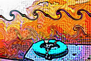
Wideload Jdogg: 5/10 It isn't much, just an invert and an animation that looks like it was preset. Slayguy: I really dont like this. Very weird but is original. 5/10 Average: 5
Silvermoon Jdogg: Pretty funny, but you saved it as really bad quality, or messed with it, and I don't like the translucent image in the backround. 6/10 Slayguy: WOOO! nice idea the background is confusing 6.5/10 Average: 6.25
Jacksonghuntington Jdogg: 7.5/10 The dots are a nice touch, and adding waves to the ocean is cool. I think you should add a different pattern to the sky though, it would really add to the picture. Slayguy: Looks like it should be a album cover. Futuristic 8/10 Average: 7.75
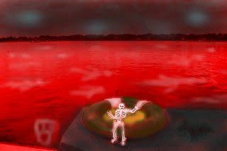
PhyscoMonkey Jdogg: I love the skeleton you added to it, but i wish it didn't glow so much. It all still looks real, even though you changed it a lot. Great entry. 8.5/10 Slayguy: Its alittle too evil for my tastes but i rather like the idea 7/10 Average: 7.75
Jdogg Jdogg: Omit Slayguy: Nice sun flair to it. looks like a photo 8/10 Average: 8/10 (way to high in my opinion :P )
3rd Place Crimsonblade Jdogg: 9/10 The first time I looked at this, I forgot that before you edited it there was a deck. Great entry, but you can still see a bit of the original image on the seal and the lifering. Maybe blurring it a bit would help. Also, the triple rainbow should be curvier. Slayguy: Lol. rainbows are a little random. and a seal with a cup? wow ok 7.5/10 Average: 8.25
2nd Place Reton Jdogg: 8/10 Great job making everything darker, and really god job on the moon. I think the reflection could be a bit wider towards the bottom. Slayguy: i like this change. Nice idea to change the time of day 9.5/10 Average: 8.75
1st Place Champion! Cenere Jdogg: Great entry. I love how it is all speckled, and the blending of the colors throughout the whole image is great. 9/10 Slayguy: Best entry so far love the style of it clap clap clap 9.5/10 Average: 9.25
Wow! Many good entries this round, almost all of them 7s or above. I have high expectations for next round!
If I can find copyright free images or royalty free images, images that I am legally allowed to use and modify, can I use them to add to the image we are supposed to change (siting sources of where I found the images)?
Slayguy: Lol. rainbows are a little random. and a seal with a cup? wow ok 7.5/10
Well actually it's a bucket. You would know this if you understood the reference I was making, but it doesn't matter now I suppose. We just got a snow day today so I have some time to make another entry for this one and already have an idea, so I will get right on that.
I decided I would try out messing with the levels, Highlights/Shadows, and a layer mask, with a warped rainbow gradient for good measure, and this is the result of that:
My pic just got smoked O.o I need to try and do more, mine seems like it wasn't changed much, even though it was frustrating due to being colorblind and my mom complaining about it. I had an other idea with the pic but didn't post it, perhaps I shall another if it is ok to have people vote on two? If not I will stick with this one