This was originall started by fluffybunny442 a while back. Lolz, I necro'd it :P
In this contest, I will give an image to you, and you alter/change the image as much as you can, and make it look super awesome. Then I will judge your image on a scale of 1-10. Also, it would be awesome if we could have 2 or 3 judges.
And, I really would like to participate in this, so if someone else could I would really appreciate it.
Oh, man. So many of these pix would make great memes or demotivational posters. I have no artistic talent though, so i couldn't make them work or participate in the contest. I like the pix though, can I copy/paste them into documents and give credit to the artists?
Jacksonhuntington Jdogg: 5.5/10 The fire looks very fake, and the rendering is not good. The effect was just a duo-tone, which looks good, but it is simple and the fire, again, makes it all look bad. Slayguy: 4.5/10 the fire looks like it shouldnt belong. it looks like an old time photo Kirby: 5.5 I approve of the fire, the picture could've gotten some treatment. Average: 5.17
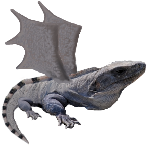
Ligaboy Jdogg: 6.5/10 Not to original of an idea, but the merging point is good. I don't like the black dots caused from sharpness, it is very distracting. Slayguy: 7/10 the affect is different but not very original. the colors went well for this picture Kirby: 6 The double effect has been used before on a different image, needs more uniqueness Average: 6.5/10 Gaboloth Jdogg: 7/10 The edges of the lizard aren't rendered perfect, so I think you should've blurred it a bit. The part where the wing meets the lizard is ok, but I know you could do better if you spent more time on it. But I love the idea. Slayguy: 6/10 i would have liked more change and a background. the idea was fine. you could have made the wings better attached Kirby: 8 Wings=winning Average: 7 3rd Place Hectichermit Jdogg: 7.5/10 I like the idea, it is original and we haven't had that much like it. I like how the lizard blends in with the backround, as if it was a chameleon. Slayguy: 7.5/10 it looks like night vision it is camo so that is a plus Kirby: 6.5 Sharpen it out and you've got night vision xD Average: 7.17
2nd Place ewaldhew Jdogg: 7.5/10 The blur is cool, because it is vertical blur, which is very unique. It also makes the lizard look like it is almost underwater, and the blue floor looks very well done. Slayguy: 8.5/10 The background went well with the lizard. looks like it is in a cold cave like an ice cave well done Kirby: 7 Not too bad, not sure what to say about it to be honest Average: 7.67
1st Place Champion! Crimsonblade55 Jdogg: 9/10 Great work again Crimson. I love the whole throwback theme, and the humor. The lizard looks like it was in the image the whole time. Flawless. Slayguy: 9.5/10 it looks like a poster/movie the background is just stunning the idea and the carryout were amazing Kirby: 9 PS skillz went into this. Winning. Average: 9.17
Good entries everyone, but lets hope we can have more this round.
-.-" If there are any mods reading this.. please delete my spammy posts above of trying to get the link to work? I shall try one more time then give up lol
By [URL=http://profile.imageshack.us/user/superninjapine]superninjapine[/URL] at 2011-03-19