This was originall started by fluffybunny442 a while back. Lolz, I necro'd it :P
In this contest, I will give an image to you, and you alter/change the image as much as you can, and make it look super awesome. Then I will judge your image on a scale of 1-10. Also, it would be awesome if we could have 2 or 3 judges.
And, I really would like to participate in this, so if someone else could I would really appreciate it.
All the judges are collected, but another speedbump crossed my path. I forgot to send Reton's pick to the judges, but Kirby noticed and still rated it. So I have to send it to slayguy.
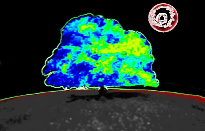
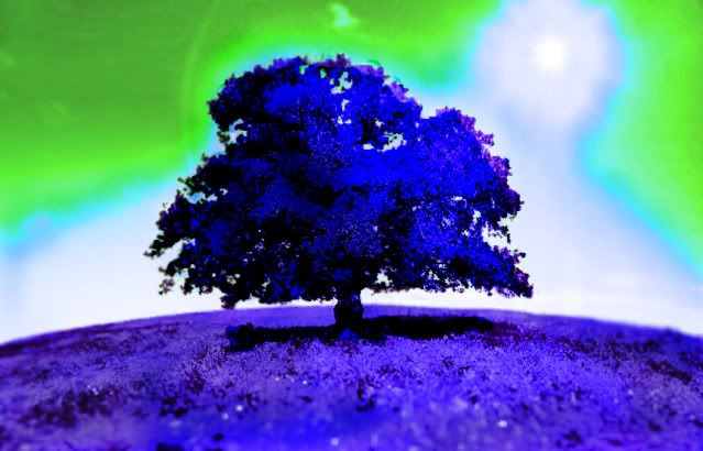
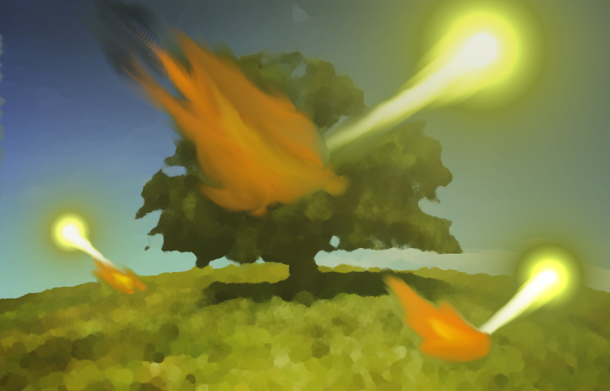
Hyper: Jdogg: 6/10 It just looks like a heat map, but I like that the backround is greyish black. Slayguy: 5/10 ehhhhhh not very interesting colors are good Kirby: 5 My sister could do that in paint to be honest, no offense Average: 5.33 iMogwai Jdogg: 6/10 Ow.. The two colored neon is cool but ugly. I like what you did with the sun. Slayguy: 6/10 tree and neon wheres the sun? Kirby: 5.9 Really ungly with the text if you ask me. Average: 5.97 Jacksonghuntington Jdogg: 7/10 The whole beige color is kind of ugly, I suggest making it more yellowy or golden, but I really like the effect on the picture. Slayguy: 7/10 looks like a heat map cool affect bad color choice Kirby: 6.7 Reminds me of coffee bleh Average: 6.9 PhyscoMonkey Jdogg: 7.5/10 This one made me laugh, and I like how when the tree merges it still looks good. Slayguy: 7/10 i like the people. i wish the sun would of stayed Kirby: 8.5 The blur effect on the ground sharpening up towards the tree provides a good focal point but it just isn't really a mergable image to me. Average: 7.67 XVERB Jdogg: 7.5/10 I really like what you did, but it doesn't look too difficult to pull off. Slayguy: 8/10 futuristic nice colors its eye popping Kirby: 8.9, looks a lot like an infrared photo except I just bon't like the black inside the tree Average: 8.13
Reton8 Jdogg: 9.5/10 Everything that you photoshopped in was great. The city could be a bit less blurry, and the life tube has a bad angle, but still very good. I love all the clouds and smoke, but the two big clouds need to be a bit more... wispier. Slayguy: wow ill be the buzz kill 6/10 random and the shoe and the sky is fuzzy
Kirby: 9.5/10 Average: 8.33
ABarOfSoap Jdogg: 8/10 The sky is really good with all of the cool colors, especially the sun. And the indigo was the best choice for the dominant color. Slayguy: 9.5/10 i really like this nice coloring and background. this worked rather well Kirby: 8 I like the 3D effect the shadow gives off but it little a little more if you ask me. Average: 8.5/10 3rd Place! CrimsonBlade55 Jdogg: 9.5/10 Great image, the whole thing looks professional, and I love the rainbow you added. Slayguy: Looks like a logo. keep it up! 9.7/10 Kirby: Probably an 8, the sky doesn't really match the brightness of the tree. Average: 9.06 2nd Place! Cenere Jdogg: 9.5/10 I like how the glow is like shading, great job with that and the other specks of color, but the sun could be better. Slayguy: 9.5/10 cenny cenny cenny another great work the grass is like fire and the tree is perfect with that bit of color sun needed work Kirby: 9 Looks pretty noice but the sun went away D: Average: 9.33 First Place Champion! Gabaloth Jdogg: 10/10 I personally love this one. The watercolor is so good, and the color of fire really looks good with the green and blue. Slayguy: 10/10 WOW cool i love this looks like a painting! Kirby: 9.3 It's a good idea I like it but would be better if it was a little bit sharper Average: 9.77 Great entries everyone! Our the average score of alll the users is improving every round. Keep up the work, and congratulations to Gabaloth!
Next image: Uploaded by RPichler at sxc.hu Deadline: March 6th
That is only 10 days, so you have to enter sooner.
In his defense I think that was on purpose since the city was supposed to be out of focus or something along those lines. Also I'm working on my entry right now.